
Accessibility in design means creating visuals and graphs, whether in print or digital, that can be appreciated by a diverse audience regardless of their physical or cognitive abilities. It ensures inclusivity and a comprehensive user experience for everyone.
While some designs are specifically aimed at people with disabilities, designing with accessibility in mind benefits everyone by enhancing the overall user experience.
What is WCAG?
The Web Content Accessibility Guidelines (WCAG) provide recommendations for making the web more accessible, particularly for users with disabilities such as color blindness and other vision impairments. WCAG defines different contrast ratio levels, categorized into three compliance levels: Level A, Level AA, and Level AAA.
- Level A: This is the most basic level of compliance. Websites at this level may not be fully accessible in all situations.
- Level AA: The most commonly required level in accessibility legislation. It ensures that your website is usable and understandable for most users in most situations.
- Level AAA: The highest level of accessibility. This is the most difficult to achieve and should be a goal only after meeting Level AA standards.
Designing with Accessibility in Mind
Color Contrast & Font Selection
Different devices and mediums, such as laptops, tablets, and print, create different visual experiences. Screens emit light and refresh constantly, which can cause eye strain. In contrast, paper reflects light and provides a stable image. This means color contrast and font selection are crucial when designing for screens.
To ensure readability, you should maintain sufficient color contrast between the text (foreground) and the background. The ideal combination is black text on a white background. WCAG recommends a contrast ratio of 4.5:1 for normal text (up to 24px) and 3:1 for larger or bold text. Tools like the WebAIM Contrast Checker can help you verify color contrast ratios based on text size.
Too much (or too little) contrast and poor color combinations can cause visual discomfort. For instance, red and blue can create an optical illusion called Chromostereopsis, making it hard to read text. Similarly, red and green combinations can be challenging for individuals with color blindness.
Font Selection
We recognize letters by familiar patterns, not by memorizing each letter version. Therefore, it is important to use fonts that allow for clear pattern recognition. While some argue that Times New Roman is the most legible, others believe sans serif fonts are better for web and small text. Factors such as height, counter size, letter spacing, and stroke width influence legibility more than the presence or absence of serifs.
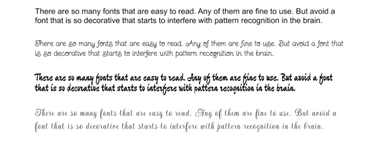
Avoid overly decorative styles that can interfere with pattern recognition when choosing fonts. Below is an example of how different fonts can affect readability:
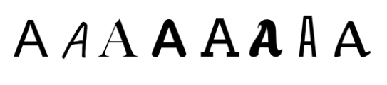
We identify letters by recognizable patterns. We haven’t memorised all the versions of the letter A. Instead, we have built a memory pattern of the letter A, and when we see something similar, the brain recognises that it’s, in fact, the letter A.
The font is not crucial for legibility unless you pick a font that is too decorative and might interfere with the brain’s ability to recognize patterns. The paragraphs below show different font styles. The first one is easy to read, but the others have progressively more difficulty in recognising the letter’s pattern.
Additional Tips for Color Contrast & Fonts
- Reading on screens is more challenging than reading on paper.
- Avoid poor color combinations like red and blue.
- Use fonts that enhance pattern recognition, avoiding too decorative ones.
Font Size Matters
Font size is another critical factor in accessibility. The text must be large enough for users of all ages to read comfortably. Typeface design also plays a role—fonts with larger x-heights (the height of lowercase letters) are generally more legible.
The ideal font size for web body text is around 12pt (16px), with larger text being at least 18pt (24px). The Web Content Accessibility Guidelines (WCAG) also recommends scalable text, meaning users can resize the text by up to 200% without losing any content or functionality.
- Choose a font size that people of all ages can read comfortably.
- The most accessible fonts are Tahoma, Calibri, Helvetica, Arial, and Verdana.
- Use a minimum font size of 14 to ensure legibility for print.
- Type sizes six and below are difficult to read (hence why it is usually reserved for copyright, trademark information, and terms and conditions).
- Avoid using fonts with very thin strokes when working with CMYK digital printing.
Designing Beyond Color: Hidden Fields and Visual Cues
Users with color blindness or other visual impairments need additional visual cues, not just color, to understand information. This includes using strokes, patterns, and icons alongside color to convey meaning.
For example, a focus indicator, like a blue outline around a clickable element, helps users identify interactive components. In graphs or infographics, redundant chromatic codes (color and line patterns) help colorblind users interpret the data without relying solely on color.
Additionally, always use alternative text (ALT text) for images to describe them for users who cannot see the visuals. ALT text should not repeat captions but instead, provide a description of the image. This practice applies to social media and forms as well. Descriptive labels and error messages also ensure that forms are accessible.
Resources for Improving Accessibility
- WebAIM Contrast Checker
- Color Vision Simulator Examples
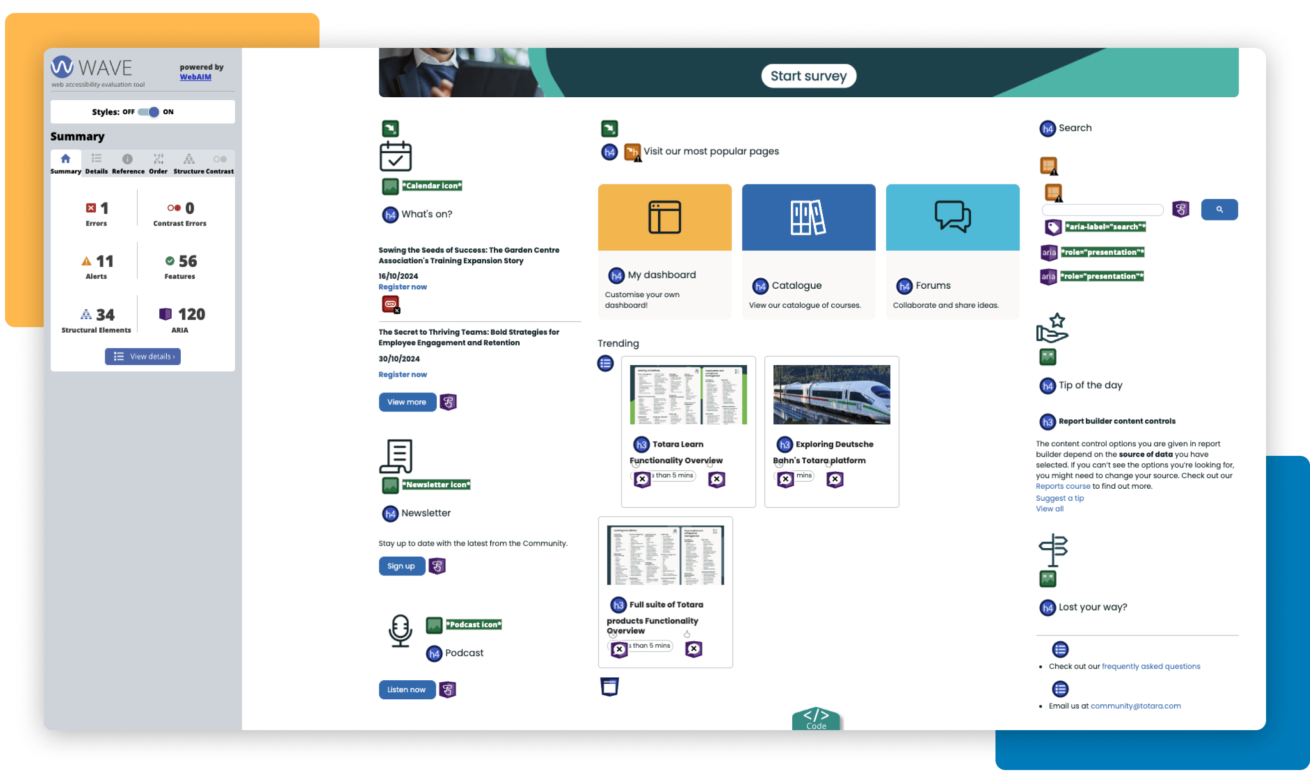
- WAVE evaluation tool: WAVE is a web accessibility evaluation tool developed by WebAIM.org. It provides visual feedback about the accessibility of your web content.
- Colorsafe.co accessible color palettes based on WCAG Guidelines of text and background contrast ratios.
- Colour Contrast Analyser (CCA)
- Colorblindly is a browser extension that helps people create website for the people with colorblindness by allowing them to simulate the experience those users have on websites.
Additional Tips
People might be able to see an image, but not as you would expect (with colour changes that make it difficult to understand its information)—e.g., a graph or diagram. That’s why you should use Alternative Text to describe the image as much as possible. If you cannot see the picture, the ALT text provides a description of it. If you don’t include any ALT text, a lot of information will be missing from the page.
The Alternative text (or ALT text) is a way to describe images or graphic elements on a website so people who cannot see them can still get an idea of what’s represented in those visual assets. So, the ALT text should not replicate the text below the image (caption) because both texts are accessible by a screen reader. This also affects images on social media, where you can include captions and ALT text in the advanced settings.
The same goes for forms. It’s good practice to ensure form fields have descriptive labels and instructions and show error messages clearly to ensure an accessible form. WebAIM is a fantastic page to check to design web elements with accessibility in mind.
- Use ALT text for all images, including those on social media.
- Avoid duplicating caption text in ALT text.
- Keep ALT text concise and informative.
- Test various font sizes and designs to ensure readability for all users.
Other Visual Elements to Consider
- Avoid justifying text (aligning both the left and right margins).
- Break text into sections with bullet points, line breaks, or short paragraphs for better readability.
Prioritizing Accessibility for All
Designing with accessibility in mind isn’t just about meeting compliance standards—it’s about creating inclusive experiences that benefit everyone. By paying attention to color contrast, font selection, and visual cues, we can ensure that digital content is usable by a broader audience, including those with visual impairments or other disabilities.
The Web Content Accessibility Guidelines (WCAG) provide a solid foundation for making websites and digital designs more accessible. But accessibility isn’t just a one-time task—it’s an ongoing commitment to improving user experiences, testing new designs, and refining them based on user feedback.
Join our upcoming webinar with Blind Veterans to learn more about the real-world challenges faced by vision-impaired learners and how simple, effective adjustments can significantly improve learning delivery.
If you found this article helpful, join 5,000 other L&D professionals in the totara.community for more resources and discussions about Totara and learning and development in the workplace.
Author
Beatriz Hermida Camacho
Last Updated
25/11/2024
Article Type
Blog
Topics
Diversity Equity & Inclusion, Learning & development
Solutions
Learn