

In the learning technologies sector, accessibility ensures that products and services are designed to accommodate users with varying needs, including those with visual, hearing, or mobility impairments. Accessibility is crucial for compliance, but the benefits of accessible design go beyond simply meeting compliance standards. It also enhances usability for all users, creating a more intuitive and inclusive experience for everyone.
Accessibility isn’t just limited to core products; organisations need to consider accessible design across all areas of their business, including user-facing documentation such as the Totara Help site.
As Totara’s Senior Technical Writer, I decided to conduct an accessibility audit of the Totara Help site, where we provide detailed product documentation primarily aimed at Site Administrators. The goal was simple: to identify and address any potential barriers preventing users from fully accessing the information they need. By conducting this audit, we aimed to improve the site’s overall usability and ensure compliance.
In this blog post, I’ll walk you through the key steps of conducting an accessibility audit, sharing practical tips and insights based on our recent experience. Whether you’re looking to achieve some quick wins or embark on a full-scale review, these steps will guide you toward creating a more inclusive and accessible user experience for all.
1. Get support from automated tools
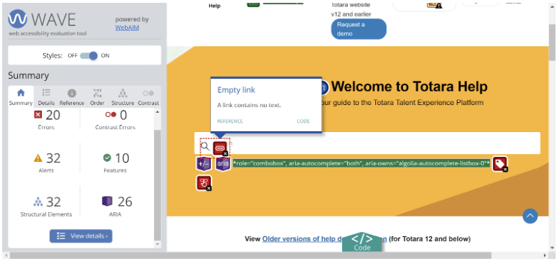
Automated tools are a great starting point for uncovering common accessibility issues quickly. They help to highlight many potential problems, but they shouldn’t be the sole method used. While testing the Totara Help site, I found that some grey text on white backgrounds had insufficient colour contrast, making it difficult for users with visual impairments. Additionally, our search bar lacked descriptive link text, which could confuse visually impaired users using screen readers.
What to do:
- Utilise accessibility extensions in your browser to scan for issues; I found the Wave Evaluation Tool extension in Google Chrome particularly useful.
- Check for problems such as colour contrast failures, empty link text, and unhelpful or missing alternative text.
- Review different page types across your site, including different types of content if possible
2. Perform manual checks
Automated tools only detect 30-40% of issues, so manual testing is critical to catch any other accessibility issues. It’s important to experience your site the way users with impairments might. When manually navigating the Totara Help site, we discovered that some elements were skipped during keyboard navigation and didn’t visually indicate when they were selected, making it hard for users relying solely on a keyboard to know where they were on the page.
What to do:
- Have a go at navigating your site using keyboard controls alone to simulate how a visually impaired or physically disabled user might interact with your platform.
- Use a screen reader to assess how your content is interpreted by assistive technologies.
3. Make improvements
Once you’ve identified any problems with your site, you can start to make improvements. For example, we fixed the colour contrast issues on the Totara Help home page by updating the CSS. Other issues, such as missing form labels and keyboard control limitations, were escalated to our documentation platform provider for future resolution. Some issues may be quick fixes, while others could require more time or coordination with external vendors.
What to do:
- Address the issues within your control, such as adding descriptive alternative text and link text, or fixing colour contrast issues using CSS.
- For elements you cannot directly modify (e.g. platform-level controls), raise support tickets with your provider.
4. Acknowledge your wins
It’s easy to focus on the areas needing improvement but acknowledging what you’re doing right is just as important. Our audit showed that the Totara Help site was already using HTML heading levels correctly, ARIA attributes, and descriptive alternative text for images, making the site more accessible for users relying on screen readers.
What to do:
- Highlight the existing accessibility features that are already in place and functioning well.
- Ensure that anything you’re doing well is documented in your processes or style guide.
5. Set a process for ongoing review and improvement
Accessibility is not a one-time fix; it requires continuous effort to maintain and improve. As a result of this audit, we’re now incorporating accessibility checks into our documentation workflow to ensure that we continue to make improvements and that we remain proactive in identifying and resolving potential issues.
What to do:
- Integrate regular accessibility reviews into your development and content processes to ensure ongoing compliance and improvement.
- Use audits as an opportunity to step back and evaluate the overall accessibility picture of your platform.
Final thoughts
Accessibility isn’t just a case of achieving a specific standard and calling the job done – instead, it’s an ongoing, iterative process in which you continually review your sites and tools to identify areas for improvement. As such, I’ll be integrating accessibility reviews into our documentation process and ensuring that we take the time to look at the broader accessibility picture. By following these steps, you can ensure that your site or platform remains accessible to as many users as possible, enhancing usability and inclusivity.
At Totara, we regularly assess our products against modern accessibility standards such as WCAG 2.0, WCAG 2.1, and Section 508. We produce an Accessibility Conformance Report (ACR) for every major release, such as our recent Totara 18 ACR. You can read more about accessibility at Totara in our developer documentation.
Join the totara.community
If you found this article helpful, join 5,000 other L&D professionals in the totara.community for more resources and discussions about Totara and learning and development in the workplace.