
This is a guest post from Kerstin Petersson, Art Director and Graphic Designer at Aleido.
Good design is about much more than just a ‘flavour’, or the way something looks – it’s about scientifically-based principles based on, among other things, pedagogy, memory technology and brand building.
In this post, we will explore five key design principles that inform the way brands design not just technology products and software, but everything else too.
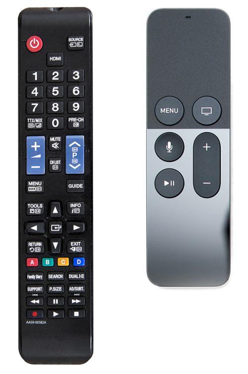
1. Stylish things are perceived to be easier to use
‘Form follows function’, said the architect Louis Sullivan in 1896. He said that if you consider function first, the design will follow. His theories made a profound impact on modern architecture.
But later research has shown that form does not always follow function. And that it may even be the other way around. Comparing two products, both of which had the same function, the product with a smoother design was considered to be easier to use. This discovery can be seen in Apple’s products. It is therefore worthwhile to focus on what looks nice if you want to create a useful product.
Other things that the beauty effect provides include:
- A generally more positive user experience
- Stronger association with the brand
- Increased willingness to use the product
- Increased desire to show the product to others
But there are also disadvantages. A product can be so elegant that you accept mistakes and flaws, which means that poor function and usability easily pass. It is therefore important to note in a user test of a product not only what the participant says but also what they do, to ensure they are not blinded by the aesthetics.
Which of the remote controls below looks easiest to use?
2. Hedwig Von Restorff effect
Hedwig Von Restorff was a German psychiatrist active in the 1930s. She discovered that what stands out is easier to remember. For instance, if you look at the image below for a few seconds and then look away, which letter are you most likely to remember?

But the effect is stronger than that: one will also more easily remember what surrounds the item that stands out. In addition, if you have two or three things that stand out, the number of things that will be remembered will increase.
- Dare to use colours or images that stand out in your design
- Play with words and text constructions
- Put information that you want to stand out in the middle of your design

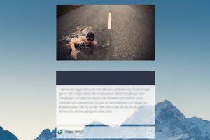
For Wise Consulting, we designed a Totara Learn platform and e-learning content (examples above). The images in the feed have no direct link to the content, but the colours harmonise nicely with the rest of the design, giving a consistent impressin. However, above all, they use the Von Restorff effect by standing out. It allows participants to easily remember what they are reading.
3. The power of negative space
The eye is an amazing organ, which evolved from parts of the brain’s cells, and the retinal nerves inside the eye are a part of the brain’s nervous system. Eyes are good at converting light into chemical signals, but only about 50% of all we see consists of sharp, colourful and high-resolution information, the rest is blurry and grey.
The brain is the one that compiles complete images. This happens, for example, by unconscious eye movements, but it is the brain that puts the pieces together, ignoring what is considered less important.
All we see, the brain must interpret and put a lot of visual information into context; for example that all objects are in 3D and not completely flat. The brain automates as much as it can, which means that what we see is a concoction of what we are seeing right now and pictures and memories from previous contexts.
The brain’s ability to interpret what we see is the reason we can fill in empty fields (negative areas) into meaningful objects and not just see something incomprehensible. Purely visually, it can be extremely effective and make us fill in the blanks for things that aren’t even there. Here is an example:
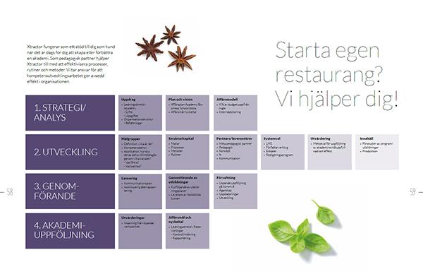
4. Chunking – the magic number 4
Your short-term memory is only about 15-30 seconds long. It allows you to remember the beginning of an opinion while you are finishing it. It also allows you to hold a conversation at all by listening to the other person while wondering what to say. Everything that you remember after 30 seconds is transferred to long-term memory.
But there are tricks that allow you to keep more in short-term memory than would be done in 30 seconds. It’s called chunking.
In 1956, the psychologist George A Miller published the article ‘The magic number seven, plus or minus two’ that deals with how much can be kept in the short-term memory simultaneously. His study found that it is easier to remember more things if they are arranged in units; for example, if a digit sequence is divided into smaller pieces. For example, to call Totara’s UK office, it is easier to remember it in chunks – 012 73 964 014, rather than 01273964014.
Although Miller published his findings in the 50s, his research is still up to date, but the magic number seven is now understood to be closer to four. Even Miller himself admitted that it’s so much easier to remember an article with a powerful name.
An example of chunking from one of Aleido’s ebooks can be found below, where information is split into four chunks to make it easier to remember.
If you want to learn more about memory, I recommend the ‘Memory and Forgotten‘ section of RadioLab.
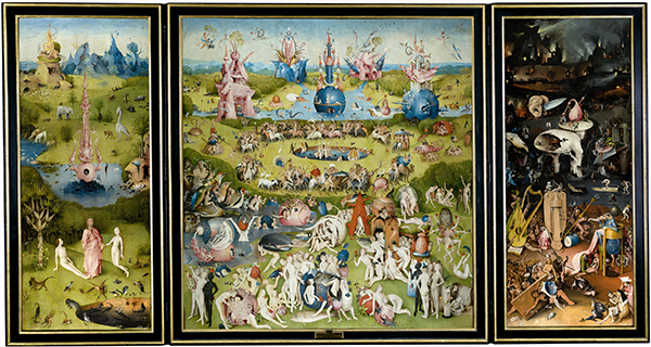
5. Horror vacui – the dangerous empowerment
Horror vacui (fear of emptiness) was attributed to Aristotle who did not believe that the vacuum existed, i.e. that nature denies emptiness. In the art world of the early 20th century, Italian craftsman Mario Praz criticised the Victorian interior style with its overcrowded rooms.
In design today, horror vacui deals with lack of white surfaces, it is crowded with information. Most often there is a fear of removing important things, but the result is that the important thing disappears in all the noise.
Using white or empty surfaces can be very effective. Together with chunking (see above) and the proximity principle (the objects that are closely related to each other are perceived as related), one can settle the chaos.
Minimalist design, with its high volume of negative space and use of blank areas, helps give the impression of exclusivity. It is a big trend in web design at the moment, as it forces the viewer to focus only on a few important pieces of information rather than making sense of huge amounts of text and graphics.
While horror vacui can also be used as a stylish and playful design element (for example, in Where’s Wally? or the work of medieval artist Hieronymus Bosch, below), it makes sense not to overwhelm your audience, and should generally be used sparingly to avoid what matters getting lost in busy designs.
If you enjoyed this post, be sure to head to the Aleido blog for more posts from their team.
Last Updated
02/08/2024
Article Type
Blog
Topics
Tips & Trends
Solutions
Learn