The Featured Links block is one of the most flexible block types within Totara Learn and gives non-designers the ability to quickly and easily create custom, graphical based navigation.
We’ve put together a few ideas on how you could use the Featured Links block to help ensure you’re taking full advantage of some of the options it provides.
1. Add the Featured Links block to the header or footer area on the front page
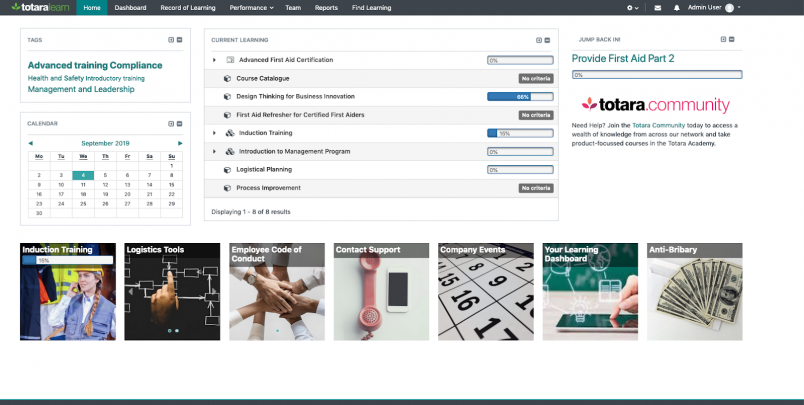
Use the header and footer block regions (introduced in Totara Learn 12) to create simple but impactful secondary navigation to important areas of your Totara Learn site. This might include internal and external links, mandatory training or a social area for members of your organisation.
By leveraging the advanced display options, you can create automatically rotating images to display within a single tile, in either a random or set order, to draw your users’ eye to the key areas of the system.
2. Add to a left or right column on a dashboard or course page
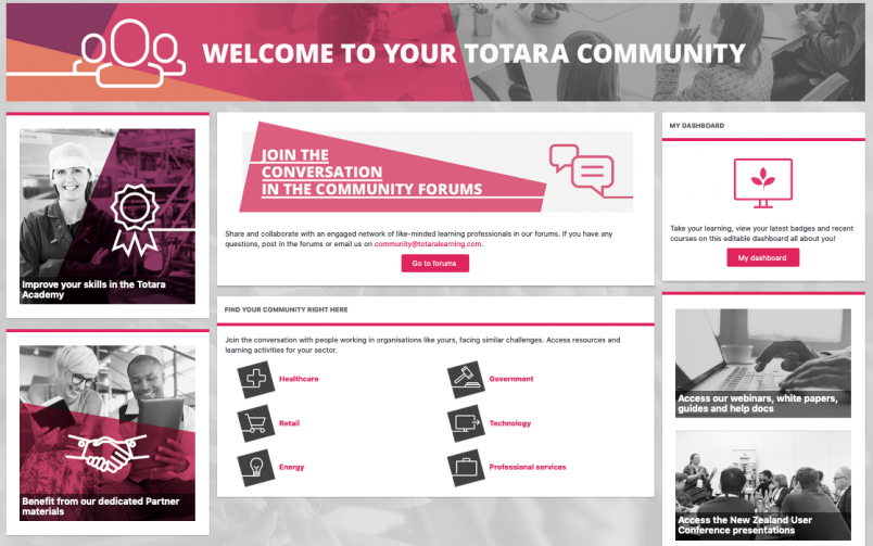
Add a Featured Links block with a single large tile image or a series of rotating images to draw users’ attention to areas of particular interest or importance for a particular group. This might be a link to a recent user survey or a particular course topic.
The Totara Community is a great example of a site using multiple single tiled Featured Link blocks to provide quick links to new and updated resources.
3. Use the access rules to display different links to different types of user in one area
Each tile within a Featured Links block can be set to allow (or prevent) visibility to specific audiences or to a group of users based on a range of preset rules.
This means administrators can create unique navigation options for different types of user such as logged in users and for guest users, or for new staff going through onboarding and existing team members.
4. Use the Featured Links block to create links to other dashboards
Being able to create any number of dashboards within Totara Learn, provides users with different roles and audience memberships quick access to all of their personalised portals.
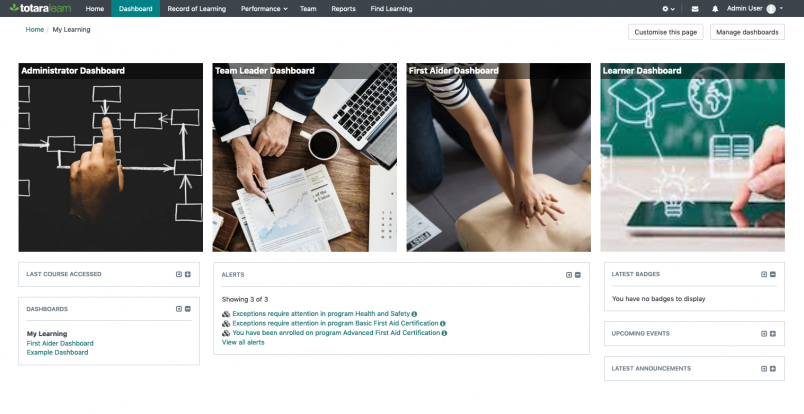
Providing highly visible navigation for users to jump between their different dashboards will enable them to access the information they need for each of their different responsibilities and interests.
5. Create custom navigation within a dashboard
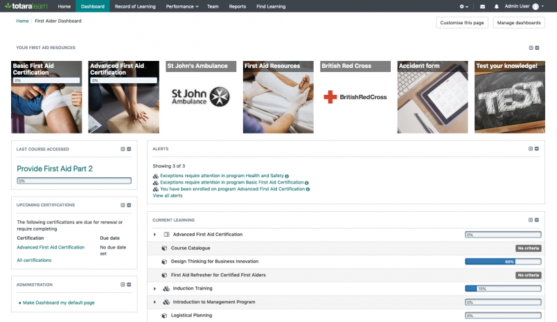
The Totara Learn front page, all dashboards and courses support any number of Featured Links blocks, allowing administrators and course managers to create custom navigation and resource portals for different groups of users.
Adding group specific navigation and resource links to dashboards will encourage staff to take advantage of their dashboards and highlight the most relevant links, learning items and resources for a particular learner.
6. Use a full-width tile and say goodbye to fancy HTML and Javascript banners
Combining the header block area with a Featured Links block using the full width tile shape, allows a site administrator to create automatically transitioning banner images with a custom ‘Call to Action’.
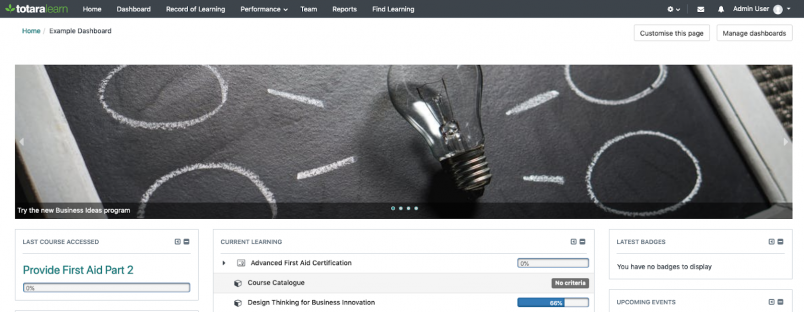
Completely configuration based (except a dragged and dropped image or two), these sliders can be added, removed and updated without the need for any HTML, CSS or Javascript.
These are just a few ideas on how to make the most of the Featured Links block within your Totara Learn site.
Why not share your ideas on using the Featured Links blocks within the dashboards and basic theming best practice wiki within the Dashboards and Basic Theming course on the Totara Academy?


