Every time we read a piece of text, the font it appears in is subtly communicating something to us. Forget the actual content for a moment – different fonts can make our messages read differently. You would be unlikely to choose Comic Sans for an obituary, and there’s a reason children’s books don’t tend to be printed in Times New Roman. So how can typography impact the learning content we create, and what do you need to know about how to choose your fonts wisely?
What is typography?
Typography is the technique of making written text legible, readable and appealing. Sadly it can seem a bit inaccessible as a subject sometimes. All these unfamiliar terms and scientific-sounding words put people off… but it doesn’t have to be intimidating. It is simply using fonts and the written word. Like everything – the more familiar you get with it, the easier it becomes.
When put to the test, you can probably name quite a few fonts from memory.
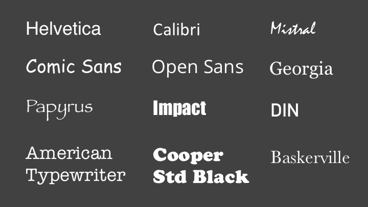
Here are 12 fonts that are quite common. Some of them aren’t the best-looking fonts in the world. Are they good? Are they bad? It is all subjective (we’ll get to that!):
t’s easy to get confused by the terminology of typography. The terms “fonts” and “typefaces” are often used interchangeably, but there is a difference between the two. Put simply, a font is what you have on your computer – it’s a collection of characters (or glyphs) in the design of a certain typeface. For instance, what you know as Helvetica is a computer font of letters in the Helvetica typeface. For the sake of this post, though, we’re going to use the term “font,” as it’s the word most people are familiar with.
Why do fonts matter?
It’s easy to think that fonts are a relatively minor part of the visual design process. As long as it’s easy to read it should be fine, right? Well, not necessarily. “Don’t mistake legibility for communication,” to quote graphic designer David Carson.

We see – and use – fonts everywhere. You encounter them every time you use an app, write a document, read a newspaper, cross the road, catch a train, browse for a birthday card and much, much more. But most people probably don’t consider the fact that many fonts are used consistently and on purpose to ensure easy recognition.
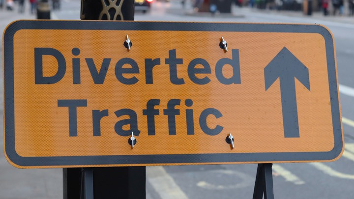
For instance, in the UK, we have a font specifically designed to be used on road signs. Transport was created by Jock Kinnear and Margaret Calvert as part of a redesign of the UK’s entire road sign system. This isn’t just a UK phenomenon; the US has their own roadside font called Highway Gothic, and in Germany they use a font called DIN.
If you think about any large organization, whether that’s the NHS, Amazon, your city’s public transport system etc., you will notice that they use their fonts consistently. This is to help you subliminally recognize them as belonging to that organization without having to think about it. Big brands like Netflix even use their own fonts, which have been specifically designed to make their communications instantly recognizable.
So what do learning designers need to know about making the right font choice for their learning?
How to choose the right font for learning
This isn’t rocket science, but it’s nonetheless often overlooked: consider the fonts you’re using. Think about the person consuming the text: your audience. What are your font choices saying about your content? The font you choose gives your writing a voice – it dresses your words in clothes. In Stop Stealing Sheep & Find Out How Type Works, the authors compare fonts to shoes in one example. If this font were a shoe, which one would it be? Would it be a sensible, sturdy brogue, a comfy trainer or a diamante-encrusted stiletto?
If you’re looking for new fonts, try Google Fonts, as everyone has access to it. But be mindful when it comes to sourcing fonts. It’s frustrating when you use a font that isn’t free when you’re on a budget, and that you can’t get access easily – particularly if you have third parties who will need to use your font to establish consistency, or, for instance, designers outside your organization who may need to edit source files. That’s why it’s best to start with what’s already on your computer – especially web-safe fonts like Tahoma, Georgia and Arial.
Another thing to remember is to not get carried away with the number of fonts you’re using – two should suffice. Using just two fonts consistently and repeatedly helps you establish your brand, creating a more consistent learning experience, and makes your copy easier to read.
Putting it into action – a real-life example
We recently created our first totara.community newspaper. While we’re all obviously familiar with newspapers, we still took the time to look at magazine layouts and the conventions used for newspaper articles to ensure we got the look and feel right.
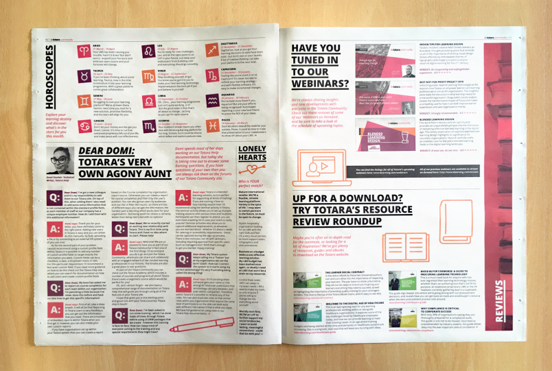
While we already have a “brand font” (Open Sans, if you’re wondering), we also looked at how the font was treated for different parts of the articles – the minimum point size on newsprint, how pull quotes looked and making sure we had multiple entry points, such as captions, intro paragraphs and teaser copy.
How do you apply this to learning content?
It’s simple – look at examples of learning that looks great. What do you like about the design? What font have they chosen? How have they used that font? What does it tell you about the content? Does the font give the impression of accessible, open, friendly messaging, or does it seem more serious and corporate?
If you want to make absolutely sure that your font is saying what it needs to, think about including a question about the font in any pilot studies you conduct. You could ask your sample set of learners what the font says to them about the content – or you could even test multiple potential fonts to see which best helps you convey the right tone.
Seriously – cut to the chase – which font should I use?
Honestly? It is subjective, and there is no easy answer to the open-ended question “What font should I use?”. Instead it is all about suitability. What are you trying to get across with your learning? What does the font make you think of? Does your font choice hammer home your message, or clash with it horribly?
Whether the messaging in your learning is serious and imperative, or relaxed and informal – make sure you consider the font the words are dressed in, be that black tie, smart casual or dress-down Friday…
For more insights on how your typography choices affect your communication, watch our webinar recording, where you’ll find out more about the history of typography and more examples of how to choose the right font for your learning platform.
Last Updated
29/08/2024
Article Type
Blog
Topics
Learning & development, Tips & Trends
Solutions
Learn